Measure
Answers, not just charts
Most survey tools stop at counting responses. FlexiSurvey reads your questionnaire, respects your sample design, and turns raw data into the findings a decision actually needs: what is driving a result, who your respondents really are, and whether a change is real.
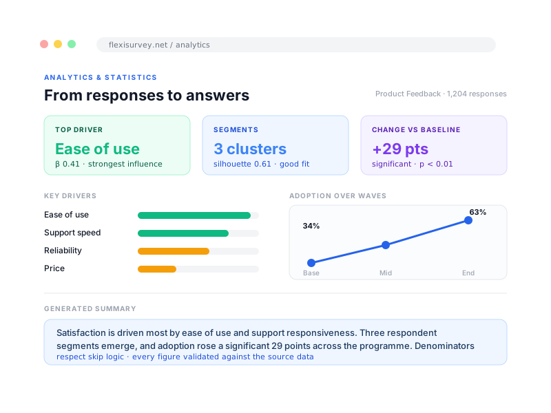
Generic charting treats every column the same. FlexiSurvey uses the survey definition, the skip logic, the quotas, the computed values and the sample design, to analyse responses the way a methodologist would: the right denominators, the right weights, the right caveats. The result is not just tidier output. It is analysis you can defend.
Classical significance tests for simple samples are reported with effect sizes and assumption hints. Where strata, clusters and weights change the variance, design-based estimation takes over, with estimators checked against R's survey package reference fixtures to within 1e-6 on every build. The two are kept distinct so a weighted estimate is never confused with an unweighted one.
What you can do
8 pillars, each one expanded further down with bullets and a screenshot.
Key-driver analysis
Regression that ranks which questions most influence an outcome, so effort goes where it moves the needle.
Segmentation and clusters
k-means clustering turns one undifferentiated sample into distinct groups, each with a profile and the features that set it apart.
Experience metrics
NPS, CSAT and CES with distributions and trends, calculated correctly and ready to report.
Wave tracking with significance
Compare baseline, midline and endline, and know whether a change is a real shift or noise.
Text analytics and sentiment
Open-ended responses are coded, themed and scored for sentiment, so qualitative answers are not left unread.
Executive summary and domain packs
A generated executive read of findings and data quality, plus sector-tuned analytics for the work you actually do.
Factor analysis and PCA
Reduce many correlated questions to underlying factors, with loadings you can read.
Self-benchmarking
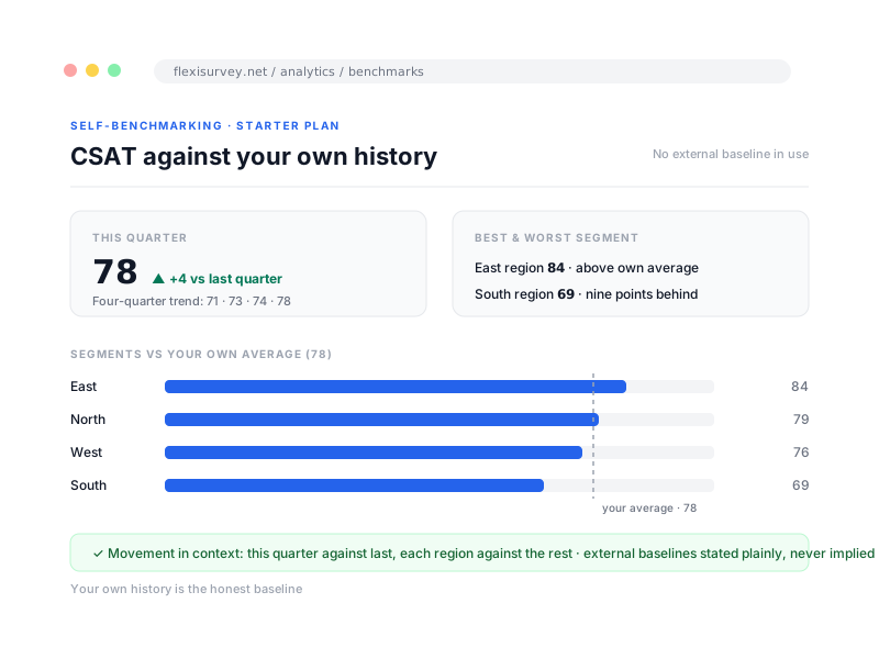
Compare a score against your own history and segments, with any external baseline stated plainly.
See what is driving a result, not just what happened
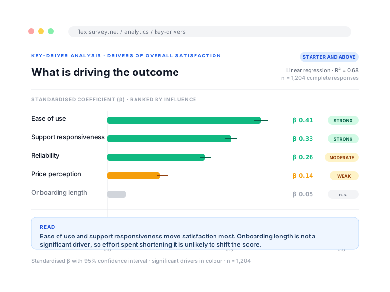
Key-driver analysis runs a regression on your live responses and ranks which questions most influence an outcome, such as satisfaction, adoption or reported risk, so you act on the drivers rather than guess from a wall of cross-tabs. Each driver is shown with its strength and direction, and the read carries straight into a recommendation rather than stopping at a coefficient table.
- Drivers ranked by strength, with direction
- Regression run on your live responses, not a sample export
- Segment the drivers to see who a factor matters to
- Reads straight into a recommendation
Move from an average to real audiences
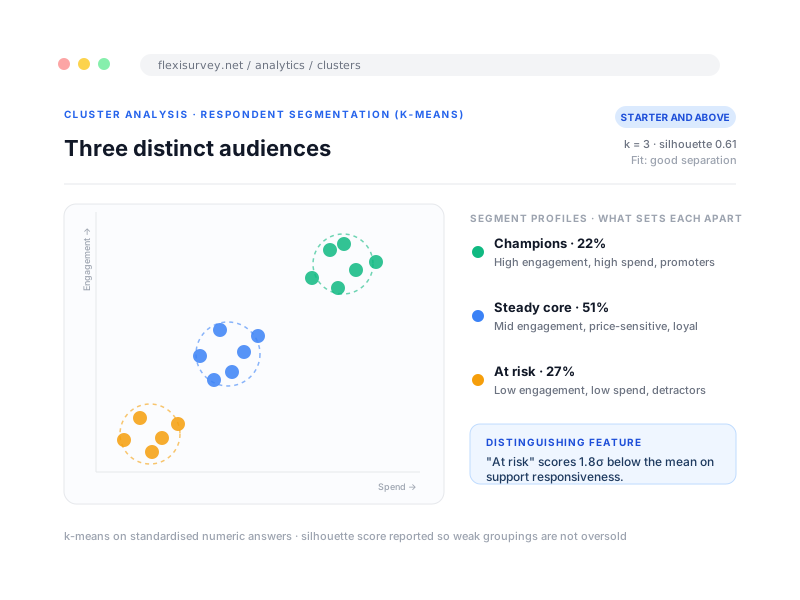
Segmentation groups respondents into meaningful clusters and shows what makes each one distinct, so a single average becomes a set of real audiences you can describe and act on. Each cluster comes with a profile and the distinguishing features that separate it from the rest, with a fit indicator so you know how well the grouping holds.
- k-means segments with a profile for each group
- Distinguishing features per cluster, ranked
- A fit indicator so weak groupings are not oversold
- Distinct from MEAL clusters, which are geographic disaggregation
Standardised experience metrics, reported correctly
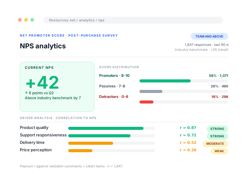
Net Promoter Score, customer and beneficiary satisfaction, and effort scores are calculated the standard way, with their distributions and trends, so an experience figure means the same thing it means everywhere else and is ready to put in front of a stakeholder. No hand-rolled formula, no quietly different denominator.
- NPS, CSAT and CES with the standard calculation
- Distributions, not just a single headline number
- Trend over time and comparison by segment
- Ready to report without a spreadsheet rebuild
Know whether a change is real
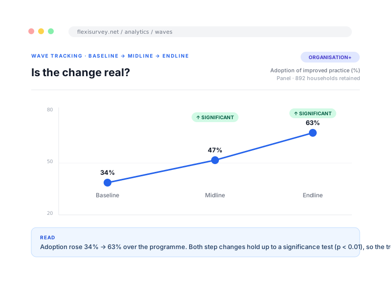
Wave tracking compares results across baseline, midline and endline and tells you whether a movement is a real shift or noise, rather than just showing two bars at different heights. Significant changes are flagged with their direction, so a report can say a difference held up to a test instead of leaving the reader to eyeball it.
- Compare baseline, midline and endline
- Significance testing on the change, with direction
- Per-question comparison across waves
- Feeds straight into a reporting period
Let open text inform the finding
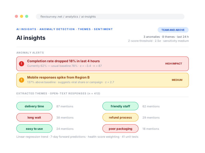
Open-ended responses are coded, themed and scored for sentiment, so the qualitative half of a survey informs the finding instead of sitting unread in a column. Where AI assistance is used it is disclosed: narrative summaries are generated from de-identified, pre-aggregated result facts, never raw response rows, and every output is checked by a validator that rejects any number or claim the data did not support.
- Sentiment and recurring-theme extraction on open text
- Themes tied back to the segments that raised them
- AI narrative grounded in your figures and validated, not implied
- AI provider, data handling and limits disclosed
A starting draft, and metrics tuned to your sector
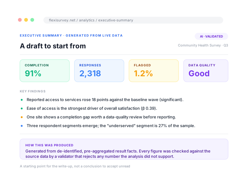
An executive summary gives a high-level read of findings, KPIs and data quality generated from the live data, so a write-up starts from a draft rather than a blank page. Sector-tuned analytics packs add the metrics that matter to a particular field, so the analysis speaks the language of the programme rather than a generic dashboard.
- Executive summary of findings, KPIs and data quality
- Cross-tab, funnel and quality views as first-class exploration
- Domain packs: agriculture and food security, fisheries, health, NGO field, public sector, research
- A draft to edit, not a conclusion to accept
Turn a long battery into a few readable dimensions
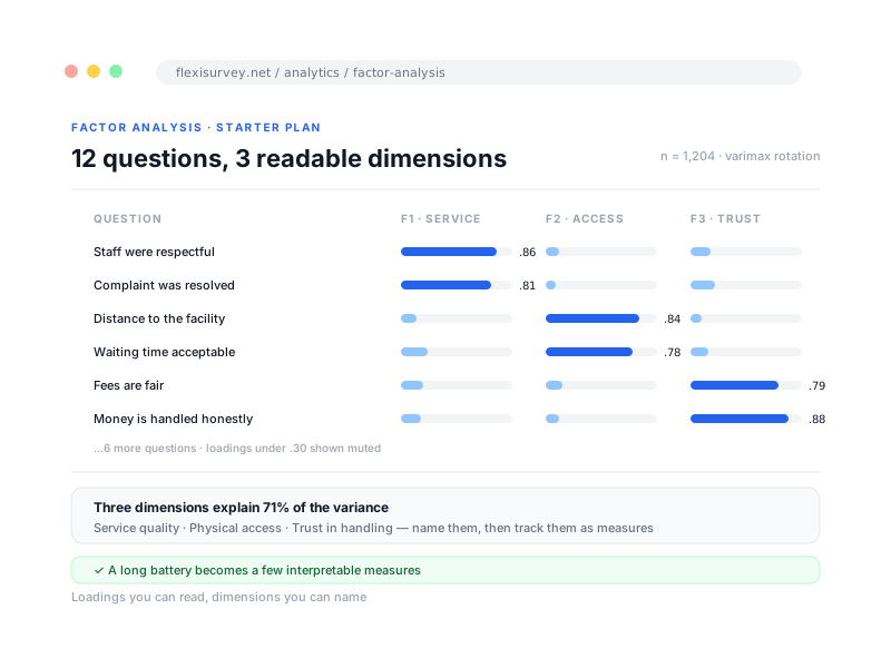
Reduce many correlated questions to the underlying factors, with loadings you can read, so a long battery becomes a small number of interpretable dimensions instead of thirty separate charts. Available on Starter and above.
- Factor analysis and principal components on your live responses
- Loadings presented so you can name each dimension
- A long battery becomes a few interpretable measures
- Available on Starter and above
See movement against your own history
Compare a score against your own history and your own segments to see movement in context: this quarter against last, this region against the others. Where an external baseline is ever used, it is stated plainly rather than implied. Available on Starter and above.
- Trend a score against your own history
- Compare segments against each other
- External baselines stated plainly, never implied
- Available on Starter and above
How it works
The typical flow from setup to output.
Responses land in one place
From web, mobile, QR, widget or panel, every channel writes back to the same dataset, with the questionnaire logic attached.
Analysis reads the questionnaire
Denominators respect your skip logic, the right statistic is chosen per question type, and design-based estimation kicks in where strata, clusters and weights apply.
Findings become a decision
Drivers, segments, significant changes and a plain-language summary, ready to report or to route to the owner who needs to act.
Plays well with
Adjacent capabilities and solution pages you might want to read next.
Design-based estimates, regression and tests validated against R to 1e-6.
Track the same respondents across waves and roll findings up across a portfolio.
Feed analysed results straight into indicators and reporting periods.
The logic and computed values that make honest denominators possible.
Role-scoped dashboards so each team sees the right slice.
Bring a dataset. We will show you the answer inside it.
Book a walkthrough with a questionnaire or a reporting requirement, and we will run the analysis your team actually needs, not a generic demo: honest denominators, the key drivers, the segments, and whether the change is real. About 20 minutes.
Talk to our team